Why Data Scientists Are Well Positioned for the AI Revolution
The three skills that have always defined the job – coding, statistics, and domain expertise – are exactly what it takes to direct AI tools like Claude Code, and to know when not to trust them.
AI
data science
R
Author
Matan Hakim
Published
June 24, 2026
Most of the AI conversation is about whose job is at risk. I want to make the opposite case for one specific role. Data scientists are about as well positioned as anyone to benefit from this wave of tools, and the reason is structural. It is baked into what the job has always been.
A data scientist has never been allowed to do just one thing. The role lives at the intersection of several disciplines, and that intersection is what makes these tools so easy to put to work. It is what lets you direct a model and, just as important, know when not to trust it.
Two diagrams that both predate the LLM era by more than a decade describe the AI-era data scientist remarkably well. One explains why the role is positioned the way it is. The other shows where that plays out day to day. I’ll use both.
The intersection: three circles
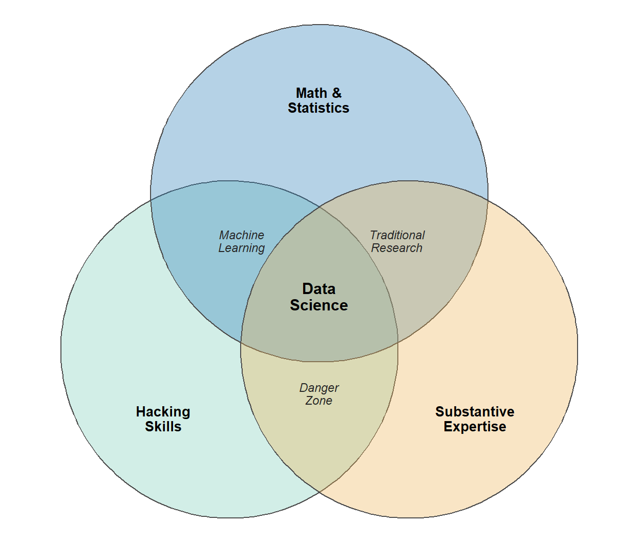
In 2010, Drew Conway drew what became the most-shared sketch in the field: the Data Science Venn Diagram.1 It places data science at the overlap of three skill sets: hacking skills (the ability to work with data and code), math and statistics knowledge, and substantive expertise in some domain.
Figure 1: Drew Conway’s Data Science Venn Diagram (2010), redrawn. Data science sits where all three skill sets overlap. The bottom overlap – coding and domain knowledge without statistics – is what Conway named the ‘danger zone’.
The center of the diagram is the famous part, but the region that matters most for this argument sits at one of the edges. Where hacking skills and substantive expertise overlap without statistics, Conway drew the danger zone: people who, in his words, “know enough to be dangerous.” They can pull and shape data, they know the domain, they can even run a regression – but they cannot tell what the output actually means, so they produce something that looks like a legitimate analysis and is quietly wrong.
Now think about what a large language model does to that picture. It hands hacking skills to anyone who can type a sentence, so overnight far more people can pull data and run a model – and Conway’s danger zone gets a lot more crowded. What keeps a data scientist out of it is holding all three circles at once, which is exactly what the job has always demanded. So it is worth taking the circles one at a time, each one an independent reason the role compounds with AI instead of being threatened by it.
Hacking skills: you can direct an agent, not just vibe with it
Andrej Karpathy coined “vibe coding” in early 2025: building software by prompting, accepting suggestions, and never really reading the code. For someone with no engineering background, that is the only mode available – you take what the model gives you and hope.
Data scientists are not software engineers, but they have absorbed software engineering’s principles. We use version control with git. We know what unit tests are and why input validation matters. We know that code headed for production behaves differently from a script that only ever runs on our own laptop. Many R users have built a package, which is software engineering in miniature: tests, documentation, dependency management, the discipline of a public interface. We are not the people who write the world’s best edge-case tests, but we know the principles and how to apply them.
That base changes the relationship with a coding agent entirely. You are in the driver’s seat – reading the diff, smelling out a bad abstraction, asking for tests, insisting on a reproducible setup, catching the silent failure before it ships. You can build things that were out of reach before, larger in scope and with real interfaces and integrations, at a quality close to professional software, without ever having had the full engineering background. The habits that make a good R package carry straight over, too. Writing a function forces you to decide exactly what goes in, what comes out, and what counts as correct – and that same act of specifying is what gets useful work out of an agent. The clearer the contract you hand it, down to the test that has to pass, the better the result it gives back.
Substantive expertise: you are the human in the loop who actually knows the domain
Every data scientist specializes in something. It might be pharma and clinical trials, finance, marketing, or, in my case, socio-economic research, and usually it narrows further inside the field. That domain knowledge is the second circle, and it is what gives the phrase “human in the loop” any teeth.
The models hallucinate, and they overreach. A human in the loop earns their place only if they can tell when the output is wrong, and domain expertise is what makes that possible. It is what lets you catch the confident, plausible, wrong answer: the invented variable, the misread coefficient, the two findings stitched together in a way that does not actually hold in your field. Without that expertise you are not supervising the model at all; you are just passing its output along with extra steps.
This is what separates running a model from vouching for it. Anyone can prompt the tool and read back what it says. Knowing your field is what lets you stand behind the answer, or push back on it, and that is the only kind of human oversight that actually changes the outcome.
Math and statistics: you know what kind of thing a model is
This is the circle whose link to AI is the least obvious of the three, so it is worth being concrete. Under the hood, a large language model is a statistical model, and statistical training builds an intuition that carries straight over.
A statistician never takes a point estimate at face value. They ask what the spread around it looks like, how far to trust it, how much it would move under a different sample. That is exactly the right reflex for a system that can give you two different answers to the same question and is confidently wrong a measurable share of the time. You treat each response as one draw to be checked, never as the final word.
“How would I know if this is wrong?” is the question statistical training drills into you. Designing a check, holding out a test, quantifying the error – that is the core of the discipline, and it is also what separates evaluating an AI’s output from simply trusting it. Writing an eval for a prompt draws on the same instinct as building a validation set for a model.
You can smell a bad quantitative claim. Models produce plausible-but-wrong statistical reasoning all the time, from correlation dressed up as causation to a confidence interval that does not mean what it says. Statistical literacy is the filter that stops those claims before they reach a stakeholder.
The through-line is calibrated distrust. Conway’s danger zone exists precisely because hacking and domain knowledge without statistics produce confident nonsense, and AI makes confident nonsense cheap to produce at scale. Statistics is the circle that inoculates you against it.
Where it plays out: the data science workflow
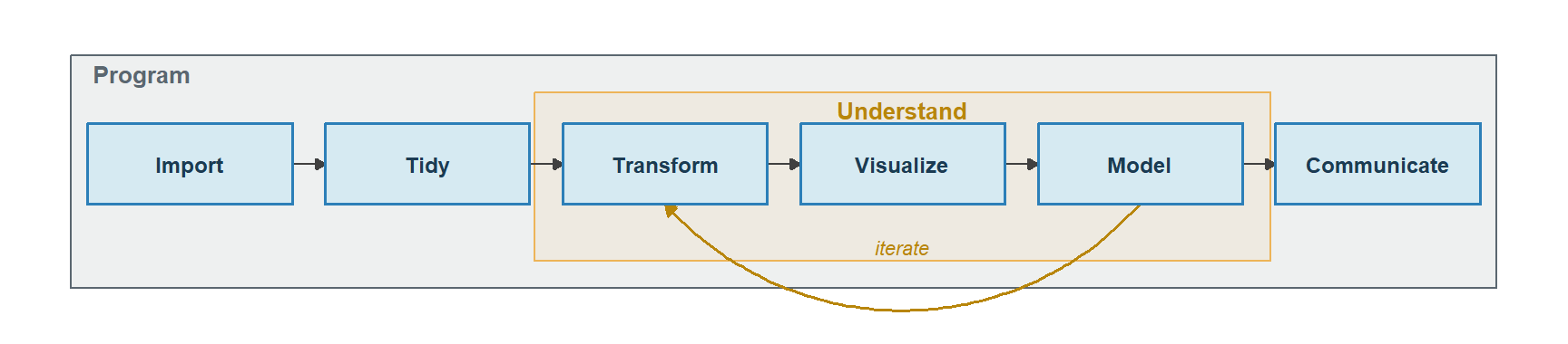
Zoom in from who the data scientist is to what they do all day. The book that taught a generation of us, R for Data Science by Hadley Wickham, Mine Çetinkaya-Rundel, and Garrett Grolemund, opens with a workflow diagram that survives unchanged from its first edition to its second. Data flows through import, then tidy, into an iterative understand loop of transform, visualize, and model, and finally out through communicate. Tidying and transforming together are called wrangling. Wrapped around all of it is programming.
Figure 2: The data science workflow from R for Data Science, redrawn. Import and tidy feed an iterative understand loop – transform, visualize, model – and the results flow out through communicate. Programming wraps the whole process.
Map the tools onto the diagram and they fall into three groups.
The data work – import, tidy, transform, model, visualize – is where the models are genuinely strong. There is an old joke that a data scientist spends 80% of the time cleaning data and the other 20% complaining about cleaning data, and tools built for this work, like Claude Code and the data-aware Posit Assistant, are aimed straight at that 80%: the boilerplate, the join you have written a hundred times, the ggplot incantation you can never quite remember. But every dataset has its gotchas – the wrong encoding, the duplicated key, the column that quietly changed meaning after 2016 – and someone has to recognize them, join the right tables, and spot the edge case. That someone is the data scientist; the model does the typing.
The programming envelope is the first circle again, made concrete. The reason you can hand an agent the data work and trust what comes back is that you bring the engineering frame – reproducibility, tests, version control – that a journalist or a pure analyst opening Claude Code for the first time simply does not have. They are starting software development from zero. You are not.
Communication is the last stage and the most underrated. Conveying results used to mean fighting the tooling: nudging a bar two pixels to the left, re-googling how to add a second y-axis (which, yes, I know is a crime against data visualization – don’t @ me), wrestling a report into shape. That friction is largely gone. What is left is the part that was always both the hardest and the most valuable. Does the chart tell a story? Is there a narrative a decision-maker can actually follow? Are you quietly assuming your audience reads a chart as fluently as you do, when they do not? Data scientists spent years learning these principles in the cracks between the technical fiddling. Now the fiddling is cheap, so the hour you used to lose hunting for the right legend position goes instead into whether the headline finding survives contact with a busy reader. The skill that used to be a luxury is now where the whole job happens.
A few more things the role gives you
The two diagrams cover most of it, but a few habits of the job belong here too.
The reproducible mindset is the AI-supervision mindset. Data scientists already think in rerunnable pipelines – scripts, notebooks, Quarto, renv lockfiles – where any result can be rebuilt from scratch. That is exactly the discipline that lets you trust agent output: if you can regenerate the whole thing on demand, you can let a machine write the steps and still stand behind the result. Supervising an AI is not a new habit for us; it is the reproducibility habit pointed at a faster, less reliable collaborator.
An analysis is already a chain of well-defined steps, and agents do their best work on decomposed, well-specified tasks. The habit of breaking a problem into import, clean, model, report is the same habit that produces a good sequence of prompts.
Translation has always been the actual job – turning a fuzzy stakeholder question into a precise computational one, and the answer back into something a human can act on. That is almost exactly the skill of turning an underspecified goal into a spec an agent can execute, then checking the result against what was really being asked.
The floor rose
None of this means the data scientist is safe while everyone else is doomed – that is not the argument. The argument is that the floor rose. The technical toil that used to eat the day – the syntax, the boilerplate, the pixel-nudging – is getting cheap, and value moves up the stack to judgment, context, and communication. The three circles Conway drew in 2010 turn out to be a strikingly good description of who already has that judgment.
The danger zone has never been more crowded, now that anyone can hack. What keeps you out of it – all three circles at once – is the thing that has always defined the work. Data scientists did not have to retool for the AI era; the role was already shaped like the era’s demands. The job now is to lean into the part that was always the point: understand the problem, trust the output only as far as it has earned, and tell the story.